September 19, 2010

Warm or Cool....or Both???

Warm Tones or Cool Tones....I have forever been of the mindset that good design required us to choose. While I have always been intrigued by the sophistication of any design that had just the perfect mix of cool colors and even welcomed those design opportunities that required me to step out of my realm of normalcy, I personally have always been smitten with the comfort and "warmth" of a warm color palette. But the very idea of mixing the two....just not an option!!!


Well, it seems I might be rethinking my "design position" on this topic. Over the last several months, I have come across several fabrics and designs that have really opening my eyes to the possibility that maybe...just maybe...with just the right mix of fabrics, paint, textures, furnishings, colors, etc.... it can work.


Cover of the March 2010 Additional of Traditional Home


http://www.traditionalhome.com/


The following pictures are some of the rooms featured in this issue designed by Kara Mann.


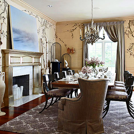
http://www.karamann.com/


And...I just thought this was really cool. RS7530019 Gold and Silver Glass Orb Pendant Lighting. (R & S Robertson Ltd.).


So.....I guess it is safe to say I am coming around! Let me know what you think.


Tina

May 29, 2010

Accessorize Your Walls

1. I find that it is best to lay out the framed artwork/pictures on a flat surface (large table or floor). This allows for a better perspective on spacing and the overall finished appearance.


2. It is best to start by placing the largest piece in the center.

3. Continue to add additional framed pieces and "build out" from all four sides of the original
center piece keeping in mind the height and width of the space you are trying to fill. If you
like symmetry, you might balance each piece placed with a similar sized piece on the opposite
side.


If you prefer a more asymmetric vignette, you might place multiple smaller
pieces on the opposite side that will just give overall balance rather than
an exact match.


4. In most cases, it is better to keep the spacing consistent between each frame.

5. Once you are pleased with the placement of each piece, you may begin the mounting process.
Additional Tips:


You can also cut a piece of art/craft paper to the size of the area in which you will be creating your vignette on the wall. Place the paper on the floor. Begin the process listed above and arrange the framed pieces on the paper. Once you are pleased with the arrangement, outline each frame on the paper. Mark the mounting positions as well (location of the mounting hardware on the back of each frame). This will ensure that each piece will be hung at the desired height. You can then use the paper as a template on the wall to not only mark the art placement, but also the actual placement of the mounting hardware.


Design Detail:

To add additional style and dimension, you can mix in various architectual pieces or wall sconces.


Notice how these art vignettes incorporate the furniture pieces below.


This is a unique way to use framed photes in a hallway or corridor.


Who says you can only use art.


It doesn't have to be art at all!


Be creative and think outside the box!


Have fun.

January 4, 2010

Design Blog: Art Project


CREATIVE WALL ART


Step1: Choose 4 picture frames (all the same size). Have a favorite snapshot blown up or use a poster that suites your home decor. Make sure that the photo or poster, when cut into four equal portions, will fit into your chosen frames.


Step 2: Cut your photo or poster into 4 equal pieces by cutting it vertically and then horizontally.


Step 3: Now place your cut pieces into the frames just as you would a picture. (We think this works best if the frames are larger that the photo pieces and a matting board or pretty decorative paper (solid or print) is used as a backdrop as seen in photo illustration, but it works either way).


Step 4: Now, hang your framed pictures on the wall as a "grouping" and in the proper order (of course) equal distances apart. In order to achieve the desired effect, the framed pieces should not be more than three inches apart. This will allow the grouping to "read" as one image.


Step 5: Step back and admire your Masterpiece!!!


Who said Art can't be affordable! After all, great design is truly in the Details!!!!


Details Design Blog

Welcome to our Design Blog! Check back often for many new and exciting updates at Details.
We plan to keep you up to date on new products as well as great design ideas. Sign up now to follow us. Stay tuned and don't miss a thing!

We are excited you are here!

Check us out @ http://www.detailsdecorate.com
Check out our sister site @ http://www.mydormdetails.com